FraudFrog
- Event
- MPCHacks hackathon — first place
- Role
- UX lead and product captain
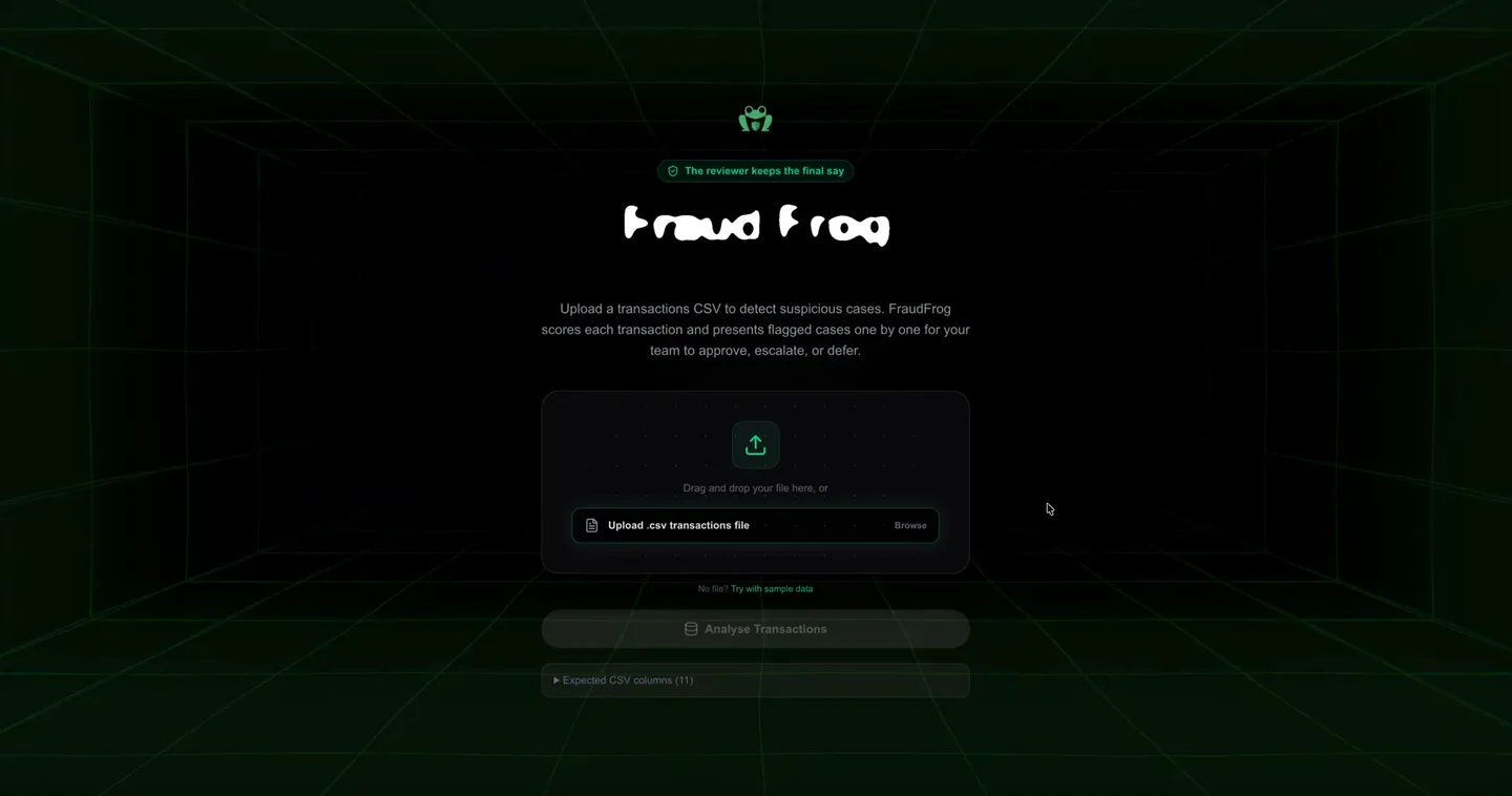
The problem
Fraud tools are good at flagging transactions and bad at helping the person who has to decide. Reviewers face a wall of alerts with little context on why each one was raised.
The idea
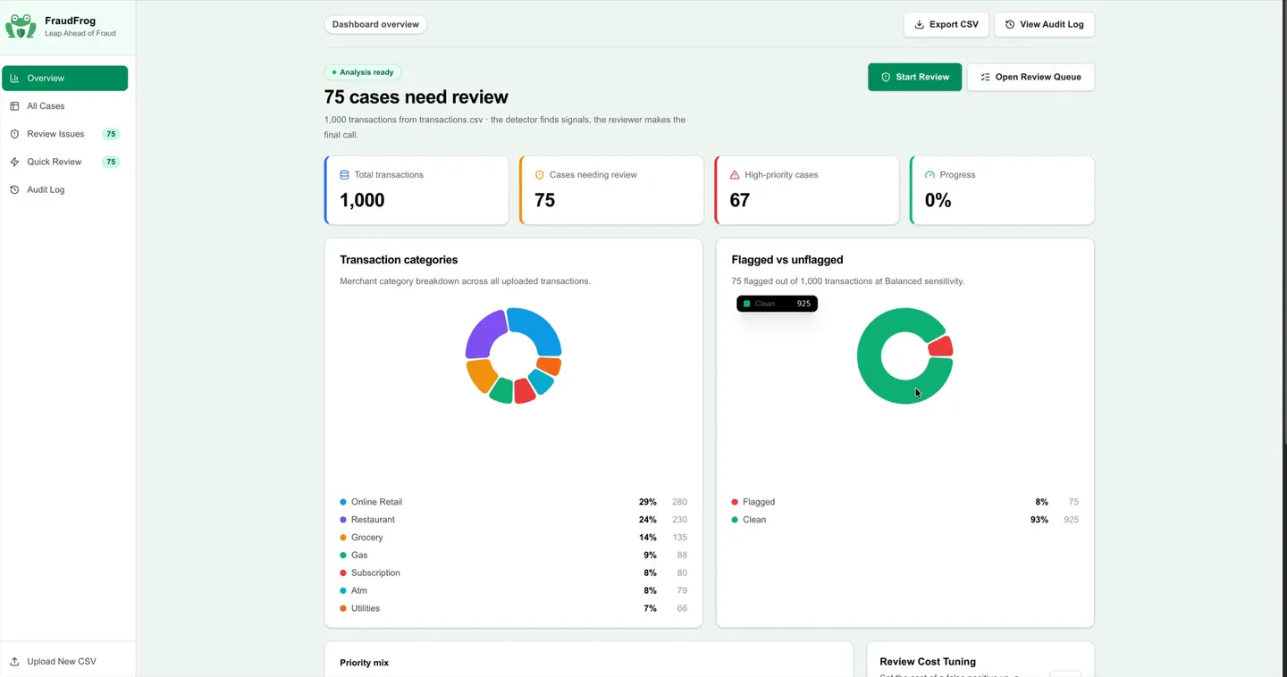
Upload a transactions CSV. FraudFrog scores every transaction, flags the suspicious ones, and presents them one by one to approve, dismiss or escalate.
One principle guided the design: the detector finds signals, the reviewer makes the final call. That line sits on the landing page and in every case.
Designing the review
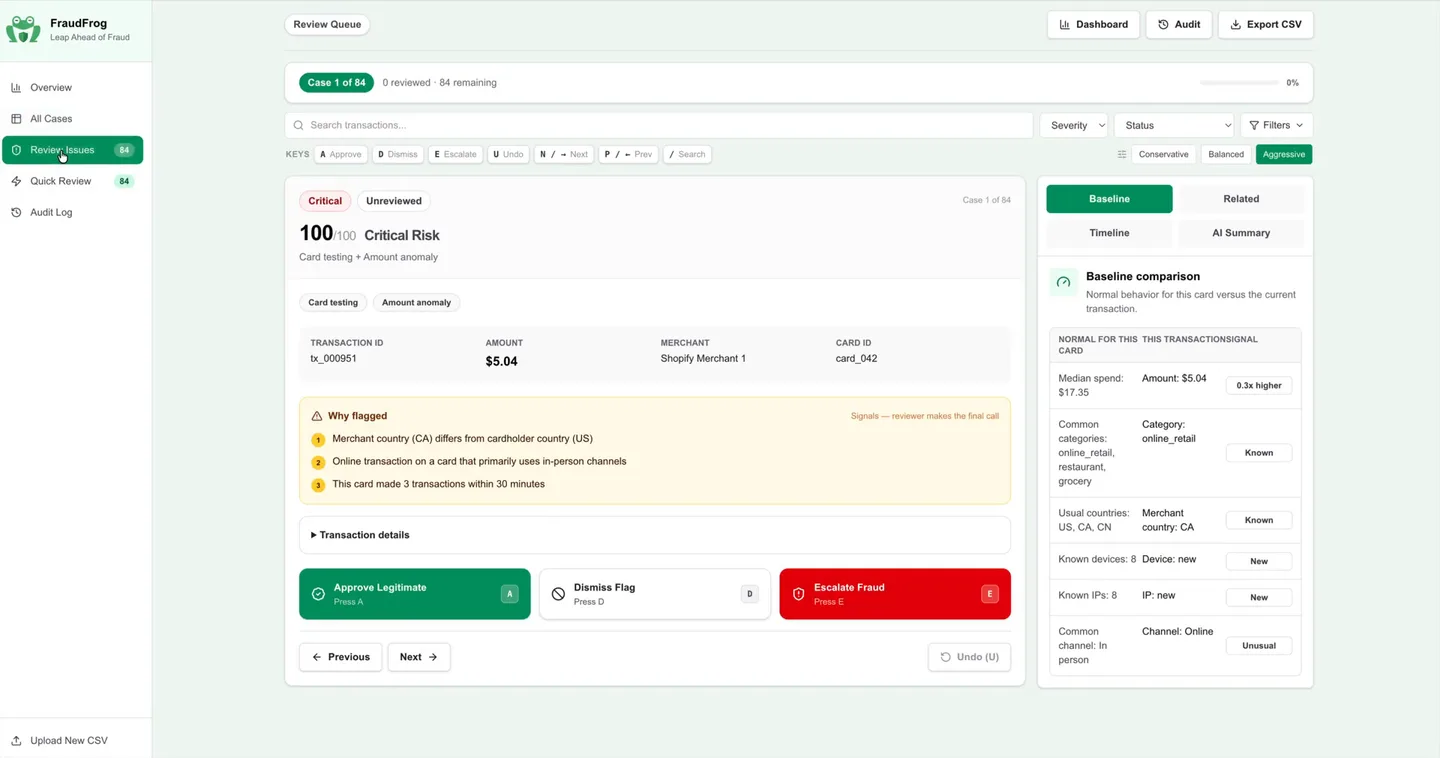
Each case explains itself. A “Why flagged” panel lists the signals in plain language, and a baseline comparison shows what is normal for that card next to what happened.
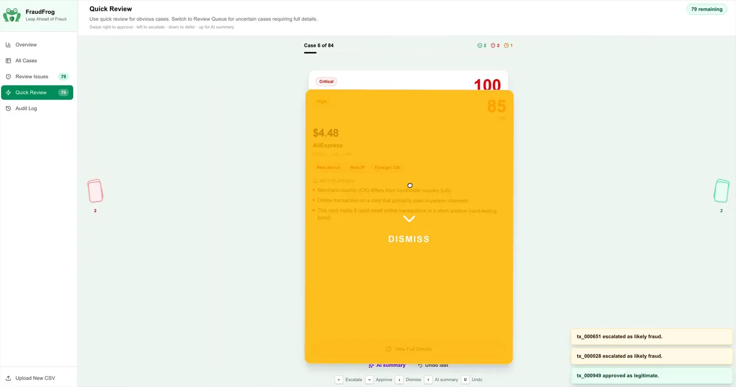
Reviewers can work fast: keyboard shortcuts for every action, undo, a quick review where you swipe a case right to approve or left to escalate, an AI summary on demand, and a sensitivity setting from conservative to aggressive.
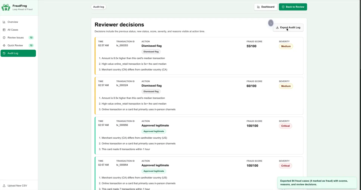
Every decision lands in an audit log that can be exported, so the team can show its work.
The landing page opens on a 3D grid tunnel, to make a dense, serious tool feel inviting from the first second.